Collective Minds.
Brand Guide.
Human medicine, clinical imaging across every site. Everything marketing, sales and partners need: logos, color, type, imagery and ready-to-use assets. One source of truth, always on brand.

The mark
The logo is the recognisable signature of Collective Minds. Protect it. Never redraw, recolor or distort it.
 Primary · on light On dark · full color
 Clear space
Keep free space equal to the height of the symbol (×) on every side.
× × Minimum size
Below these sizes the symbol loses clarity. Use the symbol alone when small.
Don't
Download logos
Vector (SVG) for print & web · transparent PNG for quick use


Color
One loud hue, everything else greyscale. Semantic colors each carry a single fixed meaning, never repurpose them. Click any swatch to copy its hex.
Typography
Marketing leads with Clash Grotesk for display and Helvetica Neue for body. Inside the product, type is Open Sans, full stop. Never mix the two worlds.
Add subject
PROJECT ID · P0001
Icons
The full FontAwesome duotone set, painted in a single color with
currentColor.
Size by container, 16–20px in controls, 24–28px in empty states. Recolor via the wrapper, never per-path.
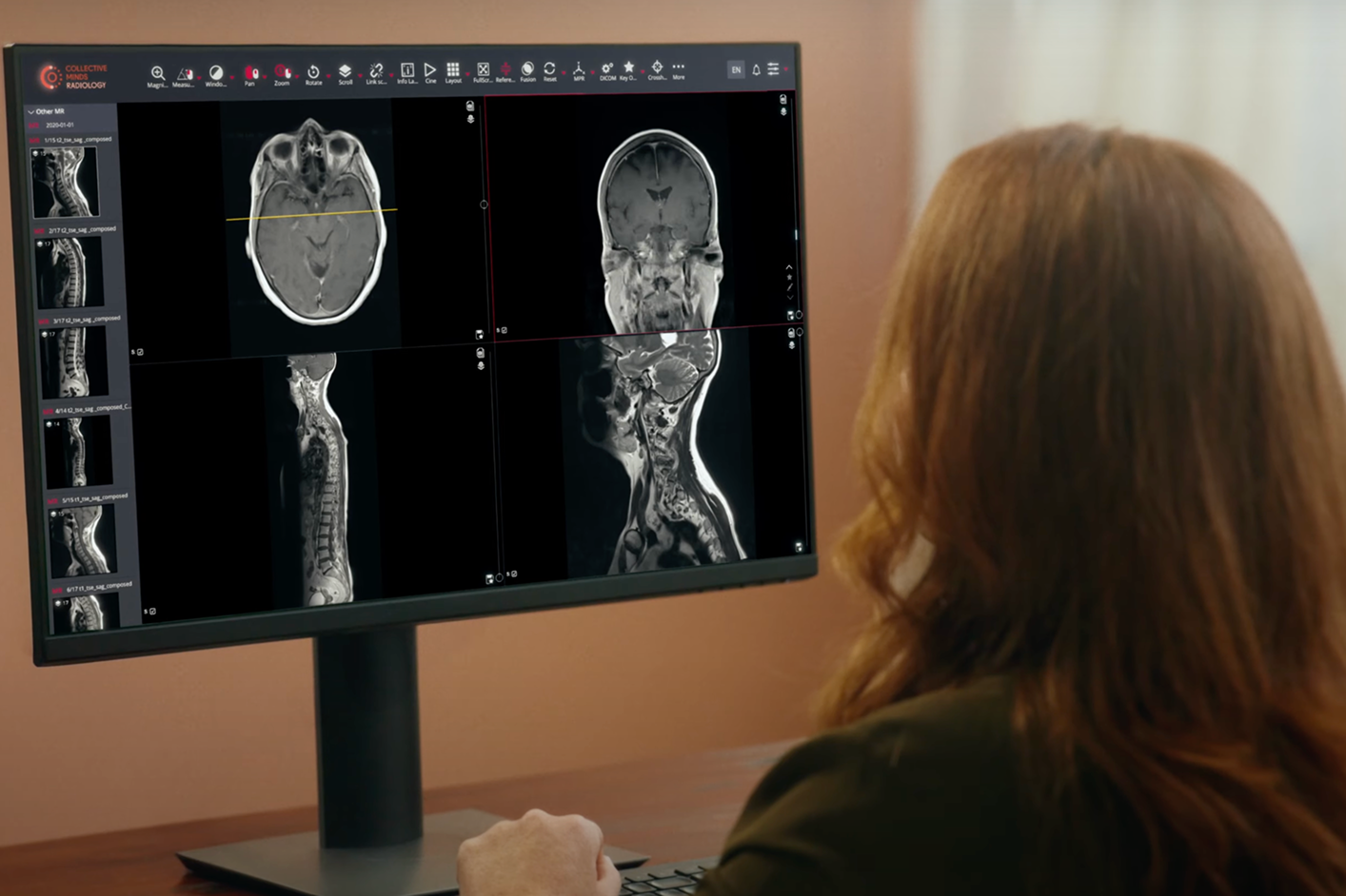
Imagery & photography
Use real images of the product in action, showing functionality in real scenarios to build trust and highlight value. Prioritise clarity, authenticity and consistency. No abstract mockups or heavy edits.

- Real product UI and authentic clinical photography
- Show hands-on interaction where relevant
- Cool, desaturated, technical tone
- Keep the latest product version on screen
- Abstract mockups or heavy photo edits
- Decorative illustration inside the product
- Outdated or pre-release screens
- Stock imagery that isn't ours
Building on-brand documents & campaigns
Start from the Figma sources below, they keep everything aligned to brand colors, fonts and layout rules. Update text, colors and images; don't rebuild from scratch.
Presentation system
Build decks and pitches from one presentation system, title, section and content layouts with the logo, type and colors locked in. Update text and visuals; the on-brand structure stays put.
Open template →Marketing graphics
Build on-brand graphics from the Figma design system by updating text, colors and images. Keep a clean, readable look, lead with real product visuals, and align to brand colors, fonts and layout rules across every platform.
Open Figma library →Print & promo
Pricelists, flyers, banners and region-selection guidelines live in one Figma file, built for Veheri but easily adapted to any product or audience while staying perfectly on brand.
Open Figma file →Events
Banners, backdrops and rollups sized to conference dimensions keep every booth consistent. The system flexes to venue requirements and supports screen-based booths for interactive setups.
Open Figma file →